Visual bookmarks vs folders: which actually helps you find links?
Visual bookmarks beat folders for finding things fast, because you recognize a link far quicker than you recall which folder you filed it in. Here is why that gap matters, and where folders still earn their place.
By Yash Kapoor··6 min read
Visual bookmarks beat folders for one simple reason: recognition is faster than recall. With a visual layout you scan a grid and spot the link you want. With folders you have to remember what you named the folder and where you put it, every time. That extra step is small, but you pay it on every lookup, which is why folder systems quietly fall apart.
This is not a knock on folders. They still have a job. The point is matching the tool to how your brain finds things.
Recognition beats recall
Your brain is far better at recognizing something it sees than recalling it from memory. A grid of bookmarks with favicons and names plays to recognition: your eye lands on the right one. A folder tree forces recall: "did I file that under Work, Reading, or Projects?" Guess wrong and you are clicking through three folders.
Folders also hide everything by default. Out of sight, out of mind. Links you filed neatly six months ago may as well not exist, because you never see them and forget they are there.
That is the core of visual bookmarks vs folders. One shows you what you have. The other asks you to remember it.
The short comparison
| Folders | Visual bookmarks | |
|---|---|---|
| How you find a link | Recall the folder | Recognize the link |
| Visibility | Hidden until opened | On screen, scannable |
| Speed past 50 links | Slows down | Stays fast |
| Filing decisions | One per save | Fewer, looser |
| Where it lives | A manager page | Often the new tab |
Where folders still win
Folders are not useless. They earn their place in a few spots.
For deep archives you rarely touch, a folder is fine; you are storing, not browsing. For strict hierarchies (tax years, client deliverables, legal docs) the tree structure matches the data. And inside a visual tool, light grouping into sections is itself a soft kind of foldering. The problem is never folders as such. It is using deep nested folders for links you need quickly.
Honestly, the failure mode we see most is over-foldering: ten top-level folders, sub-folders inside them, and a person who still cannot find last week's article. Fewer, flatter, more visible beats deep and tidy.
A quick example: the same 200 links, two ways
Picture 200 saved bookmarks. In a folder system you build maybe twelve folders, some nested, and every save becomes a small decision: does this go in Work, Clients, or Reading? Six months later you want a pricing page you saved. You open the manager, guess Clients, guess wrong, try Work, find it on the third try. Multiply that by every lookup.
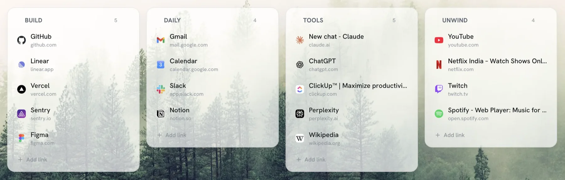
Now the visual version. The same 200 links sit in five or six sections you can see at a glance: Work, Reading, Tools, Personal. You open a tab, your eye lands on the Tools section, and the pricing page is right there. No folder to recall, no menu to open. The links you use most are the ones you see most.
That is the whole difference in practice. Folders make you remember. Visual makes you recognize.
What about tags?
Tags sit between the two. Instead of one folder per link, you attach several labels, then filter by them. Power users like Raindrop fans swear by tags, and for a large research library they work well.
The catch is the same as folders, softened: tags still depend on you recalling and typing the right label, and on tagging consistently in the first place. Most people tag for a week, then stop. A visual grid asks nothing of you after the link is placed. For a normal collection, seeing beats filtering. For a giant tagged archive, tags earn their keep.
How to switch without losing anything
You do not rebuild from scratch. You surface what you have.
- Do one cleanup pass first so you are not arranging dead links. Our guide on organizing bookmarks in Chrome covers the thirty-minute version.
- Move your active links into a visual layout, grouped into a handful of clear sections, not deep folders.
- Keep deep archives in folders if you like. Surface only what you reach for.
A visual bookmark manager like Tabisto puts that grid on your new tab page and imports your existing Chrome bookmarks in one step, so your links are visible every time you open a tab instead of buried in a menu. If you are weighing tools, our roundup of the best free bookmark manager for Chrome compares the main options.
Frequently asked questions
What are visual bookmarks?
Visual bookmarks display your saved links as a scannable grid of tiles, usually with favicons and names, instead of a text list hidden in folders. You recognize and click the link you want rather than remembering which folder you filed it in. Many visual bookmark tools place this grid on the new tab page.
Are bookmark folders bad?
No. Folders work well for deep archives and strict hierarchies you rarely browse. They break down when you use deep nested folders for links you need fast, because finding a link then depends on recalling where you filed it. For active links, a visual layout is quicker.
Do visual bookmarks replace folders entirely?
Not always. Many people keep deep archives in folders and put their active, frequently used links in a visual layout. The two can coexist. The goal is to make the links you actually use visible, not to delete every folder.
How do I make my Chrome bookmarks visual?
Install a visual bookmark manager that overrides the new tab page, then import your existing Chrome bookmarks into it in one step. Your links appear as a grid you can arrange into sections. The originals stay in Chrome, so nothing is lost in the switch.